Gerrymandering#


Racial data vs. Congressional districts#
We are now awash with data from different sources, but pulling it all together to gain insights can be difficult for many reasons. In this notebook we show how to combine data of very different types to show previously hidden relationships:
“Big data”: 300 million points indicating the location and racial or ethnic category of each resident of the USA in the 2010 census. See the datashader census notebook for a detailed analysis. Most tools would need to massively downsample this data before it could be displayed.
Map data: Image tiles from Carto showing natural geographic boundaries. Requires alignment and overlaying to match the census data.
Geographic shapes: 2015 Congressional districts for the USA, downloaded from census.gov. Requires reprojection to match the coordinate system of the image tiles.
Few if any tools can alone handle all of these data sources, but here we’ll show how freely available Python packages can easily be combined to explore even large, complex datasets interactively in a web browser. The resulting plots make it simple to explore how the racial distribution of the USA population corresponds to the geographic features of each region and how both of these are reflected in the shape of US Congressional districts. For instance, here’s an example of using this notebook to zoom in to Houston, revealing a very precisely gerrymandered Hispanic district:
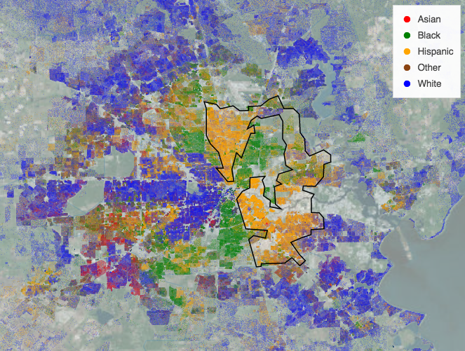
Here the US population is rendered using racial category using the key shown, with more intense colors indicating a higher population density in that pixel, and the geographic background being dimly visible where population density is low. Racially integrated neighborhoods show up as intermediate or locally mixed colors, but most neighborhoods are quite segregated, and in this case the congressional district boundary shown clearly follows the borders of this segregation.
If you run this notebook and zoom in on any urban region of interest, you can click on an area with a concentration of one racial or ethnic group to see for yourself if that district follows geographic features, state boundaries, the racial distribution, or some combination thereof.
Numerous Python packages are required for this type of analysis to work, all coordinated using conda:
Numba: Compiles low-level numerical code written in Python into very fast machine code
Dask: Distributes these numba-based workloads across multiple processing cores in your machine
Datashader: Using Numba and Dask, aggregates big datasets into a fixed-sized array suitable for display in the browser
GeoViews: Projecting and visualizing points onto a geographic map
GeoPandas: Creates an GeoDataFrame from an online shapefile of the US
HoloViews: Flexibly combine each of the data sources into a just-in-time displayable, interactive plot
hvPlot: Quickly creates interactive visualizations from Dask and GeoPandas
Bokeh: Generate JavaScript-based interactive plot from HoloViews declarative specification
Each package is maintained independently and focuses on doing one job really well, but they all combine seamlessly and with very little code to solve complex problems.
import dask
dask.config.set({"dataframe.convert-string": False})
dask.config.set({"dataframe.query-planning": False})
<dask.config.set at 0x7fd8bd512150>
import holoviews as hv
import hvplot.dask # noqa
import hvplot.pandas # noqa
import datashader as ds
import dask.dataframe as dd
import geopandas as gpd
import geoviews as gv
import cartopy.crs as ccrs
hv.extension('bokeh')
ERROR 1: PROJ: proj_create_from_database: Open of /home/runner/work/examples/examples/gerrymandering/envs/default/share/proj failed
In this notebook, we’ll load data from different sources and show it all overlaid together. First, let’s define a color key for racial/ethnic categories:
color_key = {'w':'blue', 'b':'green', 'a':'red', 'h':'orange', 'o':'saddlebrown'}
races = {'w':'White', 'b':'Black', 'a':'Asian', 'h':'Hispanic', 'o':'Other'}
color_points = hv.NdOverlay(
{races[k]: gv.Points([0,0], crs=ccrs.PlateCarree()).opts(color=v) for k, v in color_key.items()})
Next, we’ll load the 2010 US Census, with the location and race or ethnicity of every US resident as of that year (300 million data points) and define a plot using datashader to show this data with the given color key. While we would normally use Pandas to load in data, we will use Dask instead for speed since it can use all the available cores on your machine. We also “persist” the data into memory, which will be faster as long as you have enough memory; otherwise every time we zoom it would have to read from disk.
df = dd.read_parquet('./data/census.snappy.parq', engine='pyarrow')
df = df.persist()
Now we will use hvplot with datashade=True to render these points efficiently using Datashader. We also set dynspread=True which dynamically increases point size once zooming in enough that that it makes sense to focus on individual points rather than the overall distribution. We also add a tile-based map in the background for context, using tiles=.
x_range, y_range = ((-13884029.0, -7453303.5), (2818291.5, 6335972.0)) # Continental USA
shaded = df.hvplot.points(
'easting', 'northing',
datashade=True,
aggregator=ds.count_cat('race'),
cmap=color_key,
xlim=x_range,
ylim=y_range,
dynspread=True,
height=800,
width=1000,
data_aspect=1,
tiles='CartoLight',
)
shaded
Next, we’ll load congressional districts from a publicly available shapefile.
shape_path = './data/congressional_districts/cb_2015_us_cd114_5m.shp'
gdf_districts = gpd.read_file(shape_path)
gdf_districts.head()
| STATEFP | CD114FP | AFFGEOID | GEOID | LSAD | CDSESSN | ALAND | AWATER | geometry | |
|---|---|---|---|---|---|---|---|---|---|
| 0 | 24 | 06 | 5001400US2406 | 2406 | C2 | 114 | 5055929740 | 98328889 | POLYGON ((-79.48681 39.29637, -79.48607 39.344... |
| 1 | 29 | 06 | 5001400US2906 | 2906 | C2 | 114 | 47134020177 | 527100043 | POLYGON ((-95.77355 40.57820, -95.76853 40.583... |
| 2 | 47 | 06 | 5001400US4706 | 4706 | C2 | 114 | 16769383649 | 325257503 | POLYGON ((-87.13335 36.56276, -87.12099 36.613... |
| 3 | 04 | 01 | 5001400US0401 | 0401 | C2 | 114 | 142550296795 | 354326243 | POLYGON ((-114.04288 35.72475, -114.01384 35.7... |
| 4 | 19 | 04 | 5001400US1904 | 1904 | C2 | 114 | 58937778712 | 264745073 | POLYGON ((-96.63970 42.73707, -96.63589 42.741... |
Now that we have a Geopandas dataframe, we are able to plot the districts using hvPlot by setting geo=True. This setting serves a dual purpose, as geo=True tells hvPlot that the data is geographic and will use the Web Mercator projection. We also set project=True to project the data before plotting, which removes the need for projecting every time the plot is zoomed or panned.
districts = gdf_districts.hvplot.polygons(geo=True, project=True, color=None)
districts
Each of these data sources can be visualized on their own (just type their name in a separate cell), but they can also easily be combined into a single overlaid plot to see the relationships.
shaded * districts * color_points
You should now be able to interactively explore these three linked datasets, to see how they all relate to each other. In a live notebook, this plot will support a variety of interactive features including:
Pan/zoom: Select the “wheel zoom” tool at the left, and you can zoom in on any region of interest using your scroll wheel. The shapes should update immediately, while the map tiles will update as soon as they are loaded from the external server, and the racial data will be updated once it has been rendered for the current viewport by datashader. This behavior is the default for any HoloViews plot using a Bokeh backend.
Most of these interactive features are also available in the static HTML copy visible at examples.holoviz.org, with the restriction that because there is no Python process running, the racial/population data will be limited to the resolution at which it was initially rendered, rather than being dynamically re-rendered to fit the current zoom level. Thus in a static copy, the data will look pixelated, whereas in the live server you can zoom all the way down to individual datapoints (people) in each region.