Portfolio Optimization#

Portfolio Optimization helps financial investors construct portfolios to maximize expected return given a certain level of market risk, emphasizing the inherent relationship between risk and reward. We will begin by running an example of the Monte Carlo Simulation for an optimal portfolio with resulting returns. Then we will create an Efficient Frontier, which is used to identify a set of optimal portfolios that offer the highest expected return for a defined level of risk or the lowest risk for a given level of expected return. This will be done using hvPlot and HoloViews, which will allow users to visualize the trade-offs between risk and return. Lastly, we will combine all our analyses into a Panel app that enables users to dynamically explore the Efficient Frontier, adjust parameters, and visualize the resulting portfolios, streamlining the portfolio optimization process.
We will be using a variety of HoloViz tools to support portfolio optimization analysis:
hvPlot - To generate visualizations (using HoloViews and Bokeh under the hood) such as line graphs and histograms from Pandas’ DataFrames.
HoloViews - To create a dynamic link between the location of cursor-clicks and actions in a plot.
Panel - To organize all the visual components into an interactive app.
Here is a static preview:
from io import BytesIO
import numpy as np
import pandas as pd
import hvplot.pandas  # noqa
import panel as pn
import holoviews as hv
hv.extension('bokeh')
pn.extension('tabulator', design='material', template='material', theme_toggle=True, loading_indicator=True)
Initial Data Exploration and Visualization#
In this section, we’re normalizing the time series of stock prices and calculating daily returns. This gives us a quick sense of the data and allows us to visualize the performance of each stock over time.
stocks = pd.read_csv('./data/stocks.csv', index_col='Date', parse_dates=True)
stocks.head()
| aapl | cisco | ibm | amzn | |
|---|---|---|---|---|
| Date | ||||
| 2012-01-03 | 53.063218 | 15.752778 | 160.830881 | 179.03 |
| 2012-01-04 | 53.348386 | 16.057180 | 160.174781 | 177.51 |
| 2012-01-05 | 53.940658 | 15.997991 | 159.415086 | 177.61 |
| 2012-01-06 | 54.504543 | 15.938801 | 157.584912 | 182.61 |
| 2012-01-09 | 54.418089 | 16.040268 | 156.764786 | 178.56 |
Let’s first look at the daily return (percentage change from the previous day) for each stock.
stock_daily_ret = stocks.pct_change(1)
stock_daily_ret.head()
| aapl | cisco | ibm | amzn | |
|---|---|---|---|---|
| Date | ||||
| 2012-01-03 | NaN | NaN | NaN | NaN |
| 2012-01-04 | 0.005374 | 0.019324 | -0.004079 | -0.008490 |
| 2012-01-05 | 0.011102 | -0.003686 | -0.004743 | 0.000563 |
| 2012-01-06 | 0.010454 | -0.003700 | -0.011481 | 0.028152 |
| 2012-01-09 | -0.001586 | 0.006366 | -0.005204 | -0.022178 |
Calculate the mean daily return of each stock in the portfolio to provide a quick and simple measure of the average performance of each stock.
mean_daily_ret = stock_daily_ret.mean()
mean_daily_ret
aapl     0.000750
cisco    0.000599
ibm      0.000081
amzn     0.001328
dtype: float64
Let’s also calculate the correlation matrix of the percentage changes of the stocks to gain a quick understanding of the relationship between the different stocks’ returns. For each row and column pair of stocks, a value close to 1 indicates a strong positive correlation (both stocks tend to move in the same direction), a value close to -1 indicates a strong negative correlation (the stocks tend to move in opposite directions).
corr_matrix = stock_daily_ret.corr()
corr_matrix
| aapl | cisco | ibm | amzn | |
|---|---|---|---|---|
| aapl | 1.000000 | 0.301990 | 0.297498 | 0.235487 |
| cisco | 0.301990 | 1.000000 | 0.424672 | 0.284470 |
| ibm | 0.297498 | 0.424672 | 1.000000 | 0.258492 |
| amzn | 0.235487 | 0.284470 | 0.258492 | 1.000000 |
We can color the table using hvPlot to more easily identify the patterns, adjusting the color limits closer to better resolve the off-diagonal value range. We’ll employ HoloViews to overlay the value labels.
heatmap = corr_matrix.hvplot.heatmap(cmap='viridis', clim=(.25, .5), title='Daily Return Correlation')
heatmap * hv.Labels(heatmap)
Now, let’s normalize the stock prices so that they all start from the same point (the first data point), and then plot the result.
stock_normed = stocks/stocks.iloc[0]
timeseries = stock_normed.hvplot()
timeseries
Log Returns#
We will now switch over to using log returns instead of arithmetic returns. For many of our use cases, they are almost the same, but most technical analyses require detrending/normalizing the time series, and using log returns is a nice way to do that. Log returns are convenient to work with in many of the algorithms we will encounter.
For a full analysis of why we use log returns, check this great article.
log_ret = np.log(stocks/stocks.shift(1))
log_ret.head()
| aapl | cisco | ibm | amzn | |
|---|---|---|---|---|
| Date | ||||
| 2012-01-03 | NaN | NaN | NaN | NaN |
| 2012-01-04 | 0.005360 | 0.019139 | -0.004088 | -0.008526 |
| 2012-01-05 | 0.011041 | -0.003693 | -0.004754 | 0.000563 |
| 2012-01-06 | 0.010400 | -0.003707 | -0.011547 | 0.027763 |
| 2012-01-09 | -0.001587 | 0.006346 | -0.005218 | -0.022428 |
log_ret.describe().transpose()
| count | mean | std | min | 25% | 50% | 75% | max | |
|---|---|---|---|---|---|---|---|---|
| aapl | 1257.0 | 0.000614 | 0.016466 | -0.131875 | -0.007358 | 0.000455 | 0.009724 | 0.085022 |
| cisco | 1257.0 | 0.000497 | 0.014279 | -0.116091 | -0.006240 | 0.000213 | 0.007634 | 0.118862 |
| ibm | 1257.0 | 0.000011 | 0.011819 | -0.086419 | -0.005873 | 0.000049 | 0.006477 | 0.049130 |
| amzn | 1257.0 | 0.001139 | 0.019362 | -0.116503 | -0.008534 | 0.000563 | 0.011407 | 0.146225 |
Let’s create a set of histograms, one for each stock, showing the distribution of their logarithmic returns. This will help us understand the spread of returns for each stock.
log_ret_hists = log_ret.hvplot.hist(bins=100, subplots=True, width=400, \
    group_label='Ticker', grid=True).cols(2)
log_ret_hists
We can also create other plots showing the distributions of return values.
log_ret_melt = log_ret.melt(value_name='Return', var_name='Stock')
box_plot = log_ret_melt.hvplot.box(y='Return', by='Stock', color='Stock', cmap='Set2', legend=False, width=400, height=400, title='Log Return - Box')
violin_plot = log_ret_melt.hvplot.violin(y='Return', by='Stock', color='Stock', legend=False, width=400, height=400, title='Log Return - Violin')
box_plot + violin_plot
Let’s also take a look at the the covariance matrix of the log returns. Covariance measures how much two variables move together. It’s used instead of correlation because it takes into account the volatility of each individual stock, not just the correlation between them. This helps us understand the risk associated with the portfolio.
# Compute pairwise covariance of columns
log_ret.cov()
| aapl | cisco | ibm | amzn | |
|---|---|---|---|---|
| aapl | 0.000271 | 0.000071 | 0.000057 | 0.000075 |
| cisco | 0.000071 | 0.000204 | 0.000072 | 0.000079 |
| ibm | 0.000057 | 0.000072 | 0.000140 | 0.000059 |
| amzn | 0.000075 | 0.000079 | 0.000059 | 0.000375 |
There are typically 252 trading days in a year, so multiplying the daily covariance by 252 gives us an annual measure. This is useful for understanding the longer-term relationships between the stocks in the portfolio and for making decisions based on annual performance.
annual_log_ret_cov = log_ret.cov() * 252
annual_log_ret_cov
| aapl | cisco | ibm | amzn | |
|---|---|---|---|---|
| aapl | 0.068326 | 0.017854 | 0.014464 | 0.018986 |
| cisco | 0.017854 | 0.051381 | 0.018029 | 0.019956 |
| ibm | 0.014464 | 0.018029 | 0.035203 | 0.014939 |
| amzn | 0.018986 | 0.019956 | 0.014939 | 0.094470 |
And again, we can create a heatmap to better parse the resulting table. Note, the diagonal of a covariance matrix does not represent 1s as in a correlation matrix, earlier. Instead, the diagonal of a covariance matrix represents the variance of each individual variable (in this case, the variance of the log returns of each stock).
annual_log_ret_cov_heatmap = annual_log_ret_cov.hvplot.heatmap(cmap='viridis', title='Log Return Covariance')
annual_log_ret_cov_heatmap * hv.Labels(annual_log_ret_cov_heatmap)
After analyzing the daily returns and visualizing the performance of each stock, we now move on to the next step in portfolio optimization: experimenting with asset allocation.
Single Simulation of Random Asset Allocation#
In this section, we will generate a single instance of a random allocation of assets in the portfolio. This will give us a preliminary idea of how different allocations can impact the portfolio’s performance.
To ensure the reproducibility of results, we first generate a random seed. Next, we create random weights for asset allocation, assuming a portfolio of four assets. These weights are normalized to ensure the total allocation equals the entire investment. Subsequently, we calculate the expected return and variance of the portfolio. These values are used to compute the Sharpe Ratio, a metric that quantifies the risk-adjusted return of the portfolio.”
# Set seed (optional)
np.random.seed(101)

# Stock Columns
print('Stocks')
print(stocks.columns)
print('\n')

# Create Random Weights
print('Creating Random Weights')
weights = np.array(np.random.random(4))
print(weights)
print('\n')

# Rebalance Weights
print('Rebalance to sum to 1.0')
weights = weights / np.sum(weights)
print(weights)
print('\n')

# Expected Return
print('Expected Portfolio Return')
exp_ret = np.sum(log_ret.mean() * weights) *252
print(exp_ret)
print('\n')

# Expected Variance
print('Expected Volatility')
exp_vol = np.sqrt(np.dot(weights.T, np.dot(log_ret.cov() * 252, weights)))
print(exp_vol)
print('\n')

# Sharpe Ratio
SR = exp_ret/exp_vol
print('Sharpe Ratio')
print(SR)
Stocks
Index(['aapl', 'cisco', 'ibm', 'amzn'], dtype='object')


Creating Random Weights
[0.51639863 0.57066759 0.02847423 0.17152166]


Rebalance to sum to 1.0
[0.40122278 0.44338777 0.02212343 0.13326603]


Expected Portfolio Return
0.15599272049632015


Expected Volatility
0.18502649565909485


Sharpe Ratio
0.843083148392604
Simulating Thousands of Possible Allocations#
Great! Now we can just run this many times over. The Monte Carlo method relies on random sampling to approximate complex mathematical problems. By repeatedly sampling from the distribution of possible outcomes, we can estimate the characteristics of the overall distribution. This provides insights into the portfolio’s performance.
num_ports = 15000

all_weights = np.zeros((num_ports,len(stocks.columns)))
ret_arr = np.zeros(num_ports)
vol_arr = np.zeros(num_ports)
sharpe_arr = np.zeros(num_ports)

for ind in range(num_ports):

    # Create Random Weights
    weights = np.array(np.random.random(4))

    # Rebalance Weights
    weights = weights / np.sum(weights)

    # Save Weights
    all_weights[ind,:] = weights

    # Expected Return
    ret_arr[ind] = np.sum((log_ret.mean() * weights) *252)

    # Expected Variance
    vol_arr[ind] = np.sqrt(np.dot(weights.T, np.dot(log_ret.cov() * 252, weights)))

    # Sharpe Ratio
    sharpe_arr[ind] = ret_arr[ind]/vol_arr[ind]
sharpe_arr.max()
1.0303260551271078
sharpe_arr.argmax()
1419
all_weights[1419,:]
array([0.26188068, 0.20759516, 0.00110226, 0.5294219 ])
max_sr_ret = ret_arr[1419]
max_sr_vol = vol_arr[1419]
Plotting the data#
Let’s create a scatter plot using hvPlot where each point represents a portfolio, with its position determined by the portfolio’s volatility and return. The color of each point is determined by the portfolio’s Sharpe Ratio, which is a measure of risk-adjusted return.
The max_sharpe_data DataFrame contains the volatility and return of the portfolio with the highest Sharpe Ratio, i.e., the most desirable portfolio according to this measure.
We then create a separate scatter plot for this point and overlay it on the original scatter plot. This point is colored red and outlined in black to make it stand out.
data = pd.DataFrame({
    'Volatility': vol_arr,
    'Return': ret_arr,
    'Sharpe Ratio': sharpe_arr
})
max_sharpe_data = pd.DataFrame({'vol': [max_sr_vol], 'ret': [max_sr_ret]})

scatter = data.hvplot.scatter(x='Volatility', y='Return', c='Sharpe Ratio', \
    cmap='plasma', width=600, height=400, colorbar=True, padding=0.1)
max_sharpe = max_sharpe_data.hvplot.scatter(x='vol', y='ret', color='red', line_color='black', s=25,)
scatter * max_sharpe
Mathematical Optimization#
There are much better ways to find good allocation weights than just guess and check! We can use optimization functions to find the ideal weights mathematically!
Functionalize Return and SR operations#
def get_ret_vol_sr(weights):
    """
    Takes in weights, returns array or return,volatility, sharpe ratio
    """
    weights = np.array(weights)
    ret = np.sum(log_ret.mean() * weights) * 252
    vol = np.sqrt(np.dot(weights.T, np.dot(log_ret.cov() * 252, weights)))
    sr = ret/vol
    return np.array([ret,vol,sr])
from scipy.optimize import minimize
To fully understand all the parameters, check out the scipy.optimize.minimize documentation.
#help(minimize)
Optimization works as a minimization function, since we actually want to maximize the Sharpe Ratio, we will need to turn it negative so we can minimize the negative sharpe (same as maximizing the postive sharpe)
def neg_sharpe(weights):
    return  get_ret_vol_sr(weights)[2] * -1
# Contraints
def check_sum(weights):
    '''
    Returns 0 if sum of weights is 1.0
    '''
    return np.sum(weights) - 1
# By convention of minimize function it should be a function that returns zero for conditions
cons = ({'type':'eq','fun': check_sum})
# 0-1 bounds for each weight
bounds = ((0, 1), (0, 1), (0, 1), (0, 1))
# Initial Guess (equal distribution)
init_guess = [0.25,0.25,0.25,0.25]
# Sequential Least SQuares Programming (SLSQP).
opt_results = minimize(neg_sharpe,init_guess,method='SLSQP',bounds=bounds,constraints=cons)
opt_results
 message: Optimization terminated successfully
 success: True
  status: 0
     fun: -1.0307168703364677
       x: [ 2.663e-01  2.042e-01  0.000e+00  5.295e-01]
     nit: 7
     jac: [ 5.642e-05  4.184e-05  3.399e-01 -4.448e-05]
    nfev: 35
    njev: 7
opt_results.x
array([0.26628976, 0.20418982, 0. , 0.52952042])
get_ret_vol_sr(opt_results.x)
array([0.21885916, 0.21233683, 1.03071687])
All Optimal Portfolios (Efficient Frontier)#
The efficient frontier is the set of optimal portfolios that offers the highest expected return for a defined level of risk or the lowest risk for a given level of expected return. Portfolios that lie below the efficient frontier are sub-optimal, because they do not provide enough return for the level of risk. Portfolios that cluster to the right of the efficient frontier are also sub-optimal, because they have a higher level of risk for the defined rate of return.
# Our returns go from 0 to somewhere along 0.3
# Create a linspace number of points to calculate x on
frontier_y = np.linspace(0,0.3,100) # Change 100 to a lower number for slower computers!
def minimize_volatility(weights):
    return  get_ret_vol_sr(weights)[1]
frontier_volatility = []

for possible_return in frontier_y:
    # function for return
    cons = ({'type':'eq','fun': check_sum},
            {'type':'eq','fun': lambda w: get_ret_vol_sr(w)[0] - possible_return})

    result = minimize(minimize_volatility,init_guess,method='SLSQP',bounds=bounds,constraints=cons)

    frontier_volatility.append(result['fun'])
frontier = pd.DataFrame({'frontier': frontier_volatility, 'y': frontier_y})
ef_graph = scatter * frontier.hvplot.line(x='frontier', y='y', color='green', line_dash='dashed')
ef_graph
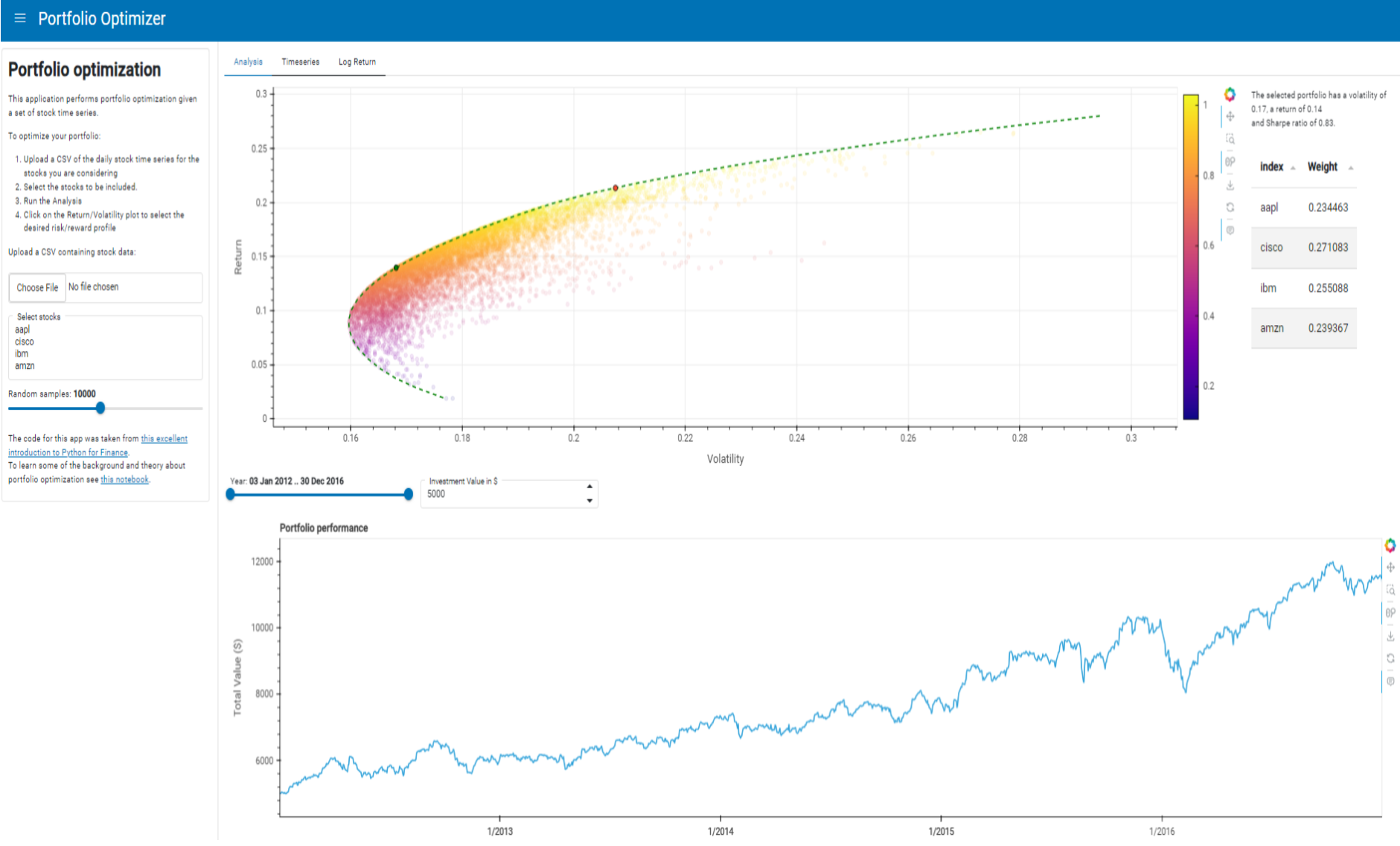
Now that we have a graph of the efficient frontier, let’s take this a step further by building a Panel app around it. The app will allow a user to upload their own CSV of stock time series which will be analyzed to create a variety of graphs including the efficient frontier. We’ll begin by first creating the sidebar for user input by using the FileInput, IntSlider, and Button widgets.
file_input = pn.widgets.FileInput(sizing_mode='stretch_width')
selector = pn.widgets.MultiSelect(
    name='Select stocks', sizing_mode='stretch_width',
    options=stocks.columns.to_list()
)


n_samples = pn.widgets.IntSlider(
    name='Random samples', value=10_000, start=1000, end=20_000, step=1000, sizing_mode='stretch_width'
)
button = pn.widgets.Button(name='Run Analysis', sizing_mode='stretch_width')
posxy = hv.streams.Tap(x=None, y=None)

text = """
#  Portfolio optimization

This application performs portfolio optimization given a set of stock time series.

To optimize your portfolio:

1. Upload a CSV of the daily stock time series for the stocks you are considering
2. Select the stocks to be included.
3. Run the Analysis
4. Click on the Return/Volatility plot to select the desired risk/reward profile

Upload a CSV containing stock data:
"""

explanation = """
The code for this app was taken from [this excellent introduction to Python for Finance](https://github.com/PrateekKumarSingh/Python/tree/master/Python%20for%20Finance/Python-for-Finance-Repo-master).
To learn some of the background and theory about portfolio optimization see [this notebook](https://github.com/PrateekKumarSingh/Python/blob/master/Python%20for%20Finance/Python-for-Finance-Repo-master/09-Python-Finance-Fundamentals/02-Portfolio-Optimization.ipynb).
"""

sidebar = pn.layout.WidgetBox(
    pn.pane.Markdown(text, margin=(0, 10)),
    file_input,
    selector,
    n_samples,
    explanation,
    max_width=350,
    sizing_mode='stretch_width'
).servable(area='sidebar')

sidebar
Now that the sidebar component has been created, we’ll create a function to read the file input by the user. Additionally, the sidebar will feature a MultiSelect widget, that allow users to selectively include stocks to their portfolio. We can take advantage of reactive expressions from Panel through pn.rx which allows the result to be returned without a callback.
@pn.cache
def get_stocks(data):
    if data is None:
        stock_file = 'https://datasets.holoviz.org/stocks/v1/stocks.csv'
    else:
        stock_file = BytesIO(data)
    return pd.read_csv(stock_file, index_col='Date', parse_dates=True)

file_input = pn.widgets.FileInput(sizing_mode='stretch_width')
stocks = pn.rx(get_stocks)(file_input)

selector = pn.widgets.MultiSelect(
    name='Select stocks', sizing_mode='stretch_width',
    options=stocks.columns.to_list()
)

selected_stocks = stocks.rx.pipe(
    lambda df, cols: df[cols] if cols else df, selector
)
Then we will define a variety of analytical functions to help us find the optimal portfolio allocation point on the efficient frontier visualization. The compute_frontier() function computes the efficient frontier using numerical optimization to find the minimum volatility portfolio for a range of expected returns. The find_best_allocation() function finds the optimal portfolio allocation that achieves the desired volatility and return.
def check_sum(weights):
    return np.sum(weights) - 1

def get_return(mean_ret, weights):
    return np.sum(mean_ret * weights) * 252

def get_volatility(log_ret, weights):
    return np.sqrt(np.dot(weights.T, np.dot(np.cov(log_ret[1:], rowvar=False) * 252, weights)))

def minimize_difference(weights, des_vol, des_ret, log_ret, mean_ret):
    ret = get_return(mean_ret, weights)
    vol = get_volatility(log_ret, weights)
    return abs(des_ret-ret) + abs(des_vol-vol)

@pn.cache
def find_best_allocation(log_return, vol, ret):
    cols = log_return.shape[1]
    vol = vol or 0
    ret = ret or 0
    mean_return = np.nanmean(log_return, axis=0)
    bounds = tuple((0, 1) for i in range(cols))
    init_guess = [1./cols for i in range(cols)]
    cons = (
        {'type':'eq','fun': check_sum},
        {'type':'eq','fun': lambda w: get_return(mean_return, w) - ret},
        {'type':'eq','fun': lambda w: get_volatility(log_return, w) - vol}
    )
    opt = minimize(
        minimize_difference, init_guess, args=(vol, ret, log_return, mean_return),
        bounds=bounds, constraints=cons
    )
    ret = get_return(mean_return, opt.x)
    vol = get_volatility(log_return, opt.x)
    return pd.Series(list(opt.x)+[ret, vol],
        index=list(log_return.columns)+['Return', 'Volatility'], name='Weight')
Using the functions above, we find our optimal portfolio allocation point and overlay this on our efficient frontier graph. We also use the Tabulator widget to create a summary of the weights of stocks in our optimal portfolio.
# Set up data pipelines
log_return = np.log(selected_stocks / selected_stocks.shift(1))
closest_allocation = log_return.pipe(find_best_allocation, posxy.param.x, posxy.param.y)

opts = {"x": "Volatility", "y": "Return", "responsive": True}
closest_point = closest_allocation.to_frame().T.hvplot.scatter(
    color="green", line_color="black", size=50, **opts
)

ef_graph = ef_graph * closest_point * max_sharpe

summary = pn.pane.Markdown(
    pn.bind(
        lambda p: f"""
    The selected portfolio has a volatility of {p.Volatility:.2f}, a return of {p.Return:.2f}
    and Sharpe ratio of {p.Return/p.Volatility:.2f}.""",
        closest_allocation,
    ),
    width=250,
)

table = pn.widgets.Tabulator(closest_allocation.to_frame().iloc[:-2])
pn.Row(ef_graph, pn.Column(summary, table), sizing_mode="stretch_both")
We will also create a line graph that will help us visualize the performance of our portfolio. Additionally, we’ve added DateRangeSlider and Spinner widgets to create more user interactivity.
investment = pn.widgets.Spinner(
    name="Investment Value in $", value=5000, step=1000, start=1000, end=100000)
year = pn.widgets.DateRangeSlider(
    name="Year",
    value=(stocks.index.rx.value.min(), stocks.index.rx.value.max()),
    start=stocks.index.min(),
    end=stocks.index.max())

def plot_performance(value_start, value_end, investment=investment.value):
    allocation = closest_allocation.iloc[:-2] * investment
    stocks_between_dates = selected_stocks.loc[value_start:value_end]
    price_on_start_date = selected_stocks.loc[value_start].iloc[0]
    plot = ((stocks_between_dates * allocation / price_on_start_date)
        .sum(axis=1)
        .hvplot.line(
            ylabel="Total Value ($)",
            title="Portfolio performance",
            responsive=True,
            min_height=400,
        ))
    return plot

performance_plot = pn.bind(
    plot_performance, year.param.value_start, year.param.value_end, investment)

performance = pn.Column(performance_plot, sizing_mode="stretch_both")

pn.Row(pn.Column(year, investment), performance)
We can take advantage of pn.Tabs which allows us to put all the graphs we have created into one app very neatly. Wow, we just created an interactive report by just using Holoviews, hvPlot, and Panel!
main = pn.Tabs(
    ('Analysis',
     pn.Column(
            pn.Row(
                ef_graph, pn.Column(summary, table),
                sizing_mode='stretch_both'),
            performance,
            sizing_mode='stretch_both')),
    ('Timeseries', timeseries),
    ('Log Return', pn.Column(
        '## Daily normalized log returns',
        'Width of distribution indicates volatility and center of distribution the mean daily return.',
        log_ret_hists,
        sizing_mode='stretch_both')),
    sizing_mode='stretch_both', min_height=1000)

pn.Row(sidebar, main).servable()