Gene Expression of Cell Subpopulations#

Introduction#
Single-cell RNA sequencing (scRNA-seq) has revolutionized our understanding of tumor heterogeneity, immune microenvironments, and treatment resistance mechanisms in cancer. However, the complexity and scale of these datasets—often containing millions of cells and thousands of genes—present significant analytical challenges for cancer researchers. This workflow demonstrates how interactive visualization tools can transform the exploration of single-cell cancer data from a technical programming exercise into an intuitive visual discovery process.
Why This Matters for Cancer Research#
In cancer biology, understanding tumor cellular heterogeneity is crucial for:
Identifying rare cell populations that may drive metastasis or treatment resistance
Characterizing tumor microenvironment interactions between cancer cells, immune cells, and stromal cells
Discovering novel therapeutic targets through differential gene expression analysis
Monitoring treatment response at single-cell resolution to understand mechanisms of resistance
This workflow showcases two complementary visualization approaches—ManifoldMap for exploring cellular landscapes and DotMap for validating cell group assignments—that when linked together, enable powerful hypothesis-driven exploration of cancer datasets.
Imports and Setup#
import holoviews as hv
import panel as pn
import hv_anndata
from hv_anndata import Dotmap, ManifoldMap
import scanpy as sc

hv_anndata.register()
hv.extension("bokeh")
pn.extension('jsoneditor')

 ⓘ
ⓘ
Loading and Inspecting the Data#
For this demonstration, we’ll use a peripheral blood mononuclear cell (PBMC) sample dataset included in the scanpy package. While PBMCs are not cancer cells themselves, they represent a critical component of cancer research and are also present in tumor samples. Understanding immune cell populations is essential for things like developing CAR-T cell therapies, predicting immunotherapy response, monitoring immune reconstitution after bone marrow transplantation, and studying tumor-infiltrating lymphocytes.
adata = sc.datasets.pbmc68k_reduced()
adata
AnnData object with n_obs × n_vars = 700 × 765
    obs: 'bulk_labels', 'n_genes', 'percent_mito', 'n_counts', 'S_score', 'G2M_score', 'phase', 'louvain'
    var: 'n_counts', 'means', 'dispersions', 'dispersions_norm', 'highly_variable'
    uns: 'bulk_labels_colors', 'louvain', 'louvain_colors', 'neighbors', 'pca', 'rank_genes_groups'
    obsm: 'X_pca', 'X_umap'
    varm: 'PCs'
    obsp: 'distances', 'connectivities'
The above output should look like the following:
AnnData object with n_obs × n_vars = 700 × 765
    obs: 'bulk_labels', 'n_genes', 'percent_mito', 'n_counts', 'S_score', 'G2M_score', 'phase', 'louvain'
    var: 'n_counts', 'means', 'dispersions', 'dispersions_norm', 'highly_variable'
    uns: 'bulk_labels_colors', 'louvain', 'louvain_colors', 'neighbors', 'pca', 'rank_genes_groups'
    obsm: 'X_pca', 'X_umap'
    varm: 'PCs'
    obsp: 'distances', 'connectivities'
This AnnData object contains pre-computed dimensionality reductions (PCA, UMAP) stored in the obsm space. If your dataset doesn’t have these, refer to the scanpy preprocessing tutorial.
Part 1: High-Dimensional Similarity Patterns with ManifoldMap#
The ManifoldMap visualization allows researchers to explore the cellular landscape of their samples through dimensionality reduction techniques like UMAP, t-SNE, or PCA. These techniques compress high-dimensional gene expression data into low-dimensional (e.g. 2D) representations that often expose cellular relationships.
Clinical Research Applications#
In the cancer research context, ManifoldMap-type of visualizations can help researchers:
Identify distinct cell populations within tumor biopsies
Track clonal evolution by visualizing genetic or transcriptomic similarities
Assess treatment effects by comparing pre- and post-treatment cellular landscapes
Discover transitional cell states that may indicate epithelial-to-mesenchymal transition (EMT)
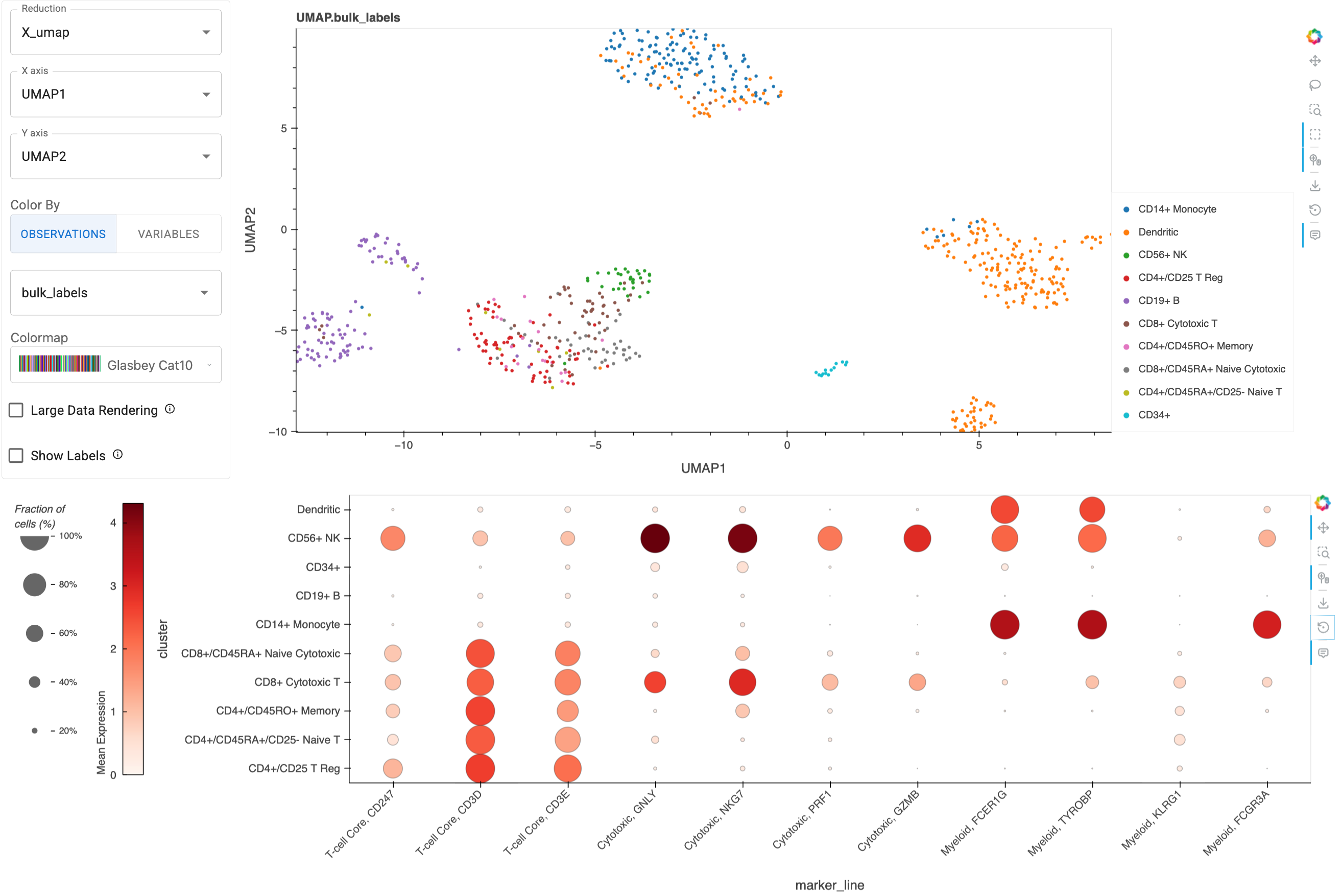
mm = ManifoldMap(adata=adata)
mm
ManifoldMap widgets:#
Reduction: Switch between dimensionality reduction methods to reveal different aspects of cellular relationshipsX axis,Y axis: Explore different dimension combinations (in this case, PCA has several to choose from) to investigate population patternsColor By:Use
Observationsto color by metadata (e.g., patient ID, treatment status, sample location)Use
Variablesto visualize gene expression (e.g., CD8A for cytotoxic T cells, PD-1 for exhausted T cells)
Colormap: Automatically adapts between categorical and continuous colormapsLarge Data Rendering: Enable Datashader for large (e.g. >1M cell) datasetsShow Labels: Dynamically position cell type labels for clear visualization
Performance Note
For large cancer atlas datasets (>1M cells), enable Datashader to maintain interactive performance while preserving accurate density patterns.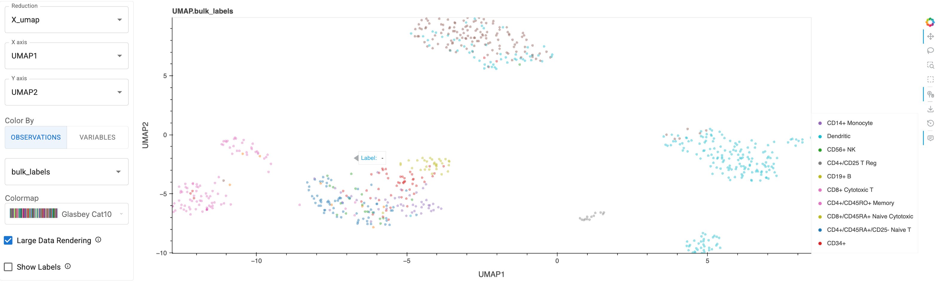
Here’s a static snapshot of what the previous cell produces in a live notebook. 👉
Part 2: Validating Cell-Groupings with Dotmap#
While dimensionality reduction reveals similarity structure between cellular populations based on high-dimensional measurements, dotmap (or ‘dotplot’) visualizations are common and complementary tool for validating cell groupings using marker_genes that are known to be associated with, e.g. a particular cell-type, biological function, or cancer. This is critical in cancer research for:
Confirming immune cell subtypes for immunotherapy applications
Identifying cancer stem cells using ‘stemness’ markers
Detecting metastatic cells through epithelial/mesenchymal markers
Characterizing the tumor microenvironment composition
Understanding Marker Gene Selection#
In cancer research, marker genes are selected based on:
Literature-validated markers for specific cell types (e.g. PanglaoDB, Annotation of cell types (ACT))
Tissue-specific expression patterns relevant to the tumor type
Therapeutic relevance (e.g., immune checkpoint molecules, drug targets)
Differential Expression analysis on the result of clustering the dataset (e.g. with scanpy’s
rank_genes_groups)
Let’s start by creatign a Dotmap with example marker genes relevant to cancer immunotherapy, grouping the cells by their bulk_labels:
Marker Gene Input Note
Marker gene input should be a list or dict (in the case of grouped genes), which are a subset from the list of genes included in the dataset, which can be accessed with `adata.var_names`. If we pass a grouped genes dict, then we'll get an extra `Active Group` widget to customize the grouping.immuno_mgenes = {
'T-cell Core': ['CD247', 'CD3D', 'CD3E'], # Pan T-cell markers
'Cytotoxic': ["GNLY", "NKG7", "PRF1", "GZMB"], # Cytotoxic function
'Myeloid': ["FCER1G", "TYROBP", "KLRG1", "FCGR3A"] # Myeloid lineage
}
immuno_dm = Dotmap(
adata=adata,
marker_genes=immuno_mgenes,
groupby='bulk_labels'
)
immuno_dm
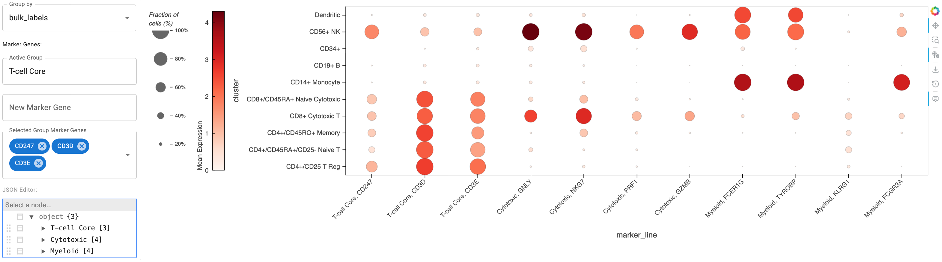
Here’s a static snapshot of what the previous cell produces in a live notebook 👉
Deriving Marker Genes From Data#
An alternative to curating known marker genes is to derive the most differentially expressed genes per cell-grouping/cluster. For this, we can use scanpy:
sc.tl.rank_genes_groups(adata, groupby="bulk_labels", method="wilcoxon")
Now collect the top 2 differentially expressed marker_genes per group:
names_data = adata.uns["rank_genes_groups"]["names"]
top_n = 2
de_mgenes = {}
for key in names_data.dtype.names:
    de_mgenes[key] = [str(gene) for gene in names_data[key][:top_n]]
de_mgenes
{'CD4+/CD25 T Reg': ['CD3D', 'CD3E'],
 'CD4+/CD45RA+/CD25- Naive T': ['ITM2A', 'CD3D'],
 'CD4+/CD45RO+ Memory': ['CD3D', 'AES'],
 'CD8+ Cytotoxic T': ['CCL5', 'NKG7'],
 'CD8+/CD45RA+ Naive Cytotoxic': ['CD7', 'CD3D'],
 'CD14+ Monocyte': ['FTL', 'AIF1'],
 'CD19+ B': ['CD79A', 'CD79B'],
 'CD34+': ['HNRNPA1', 'NPM1'],
 'CD56+ NK': ['NKG7', 'GNLY'],
 'Dendritic': ['LYZ', 'CST3']}
de_dm = Dotmap(
    adata=adata,
    marker_genes=de_mgenes,
    groupby='bulk_labels',
)
de_dm
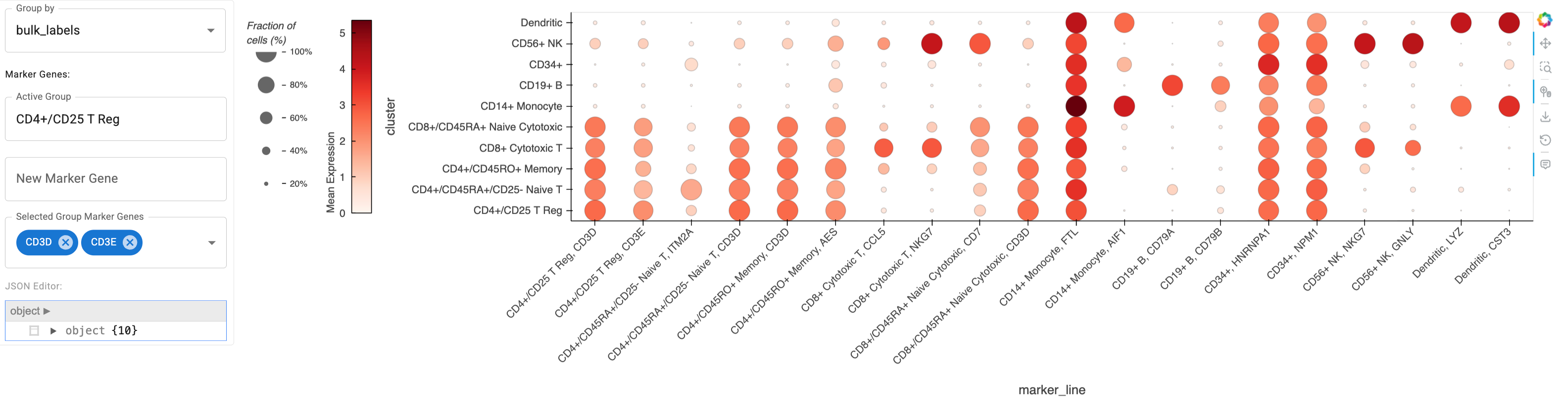
Here’s a static snapshot of what the previous cell produces in a live notebook 👉
That looks great! Now let’s play with the widgets…
Dotmap Widget UI#
Here’s an overview on the functionality for editing the included genes from the dotmap widget set:
Active Group: Will appear if ‘marker_genes’ was as a dict. This widget allows for switching between the gene groupings for the following widget updates.New Marker Gene: Textual input field to add another gene (from the list ofadata.var_names) to be included in theActive Group. Adding a gene will update the plot.Selected Group Marker Genes: Use this widget to remove genes from this, either with the ‘X’ on each pill or via unselecting in the dropdown menu.JSON Editor: View the included genes in a dropdown form. It is also possible to edit the genes directly from this widget, although we recommend using one of the above widgets for editing.
Available Genes Note
You can programmatically access the full list of available genes in this dataset with 'list(adata.var_names))'Part 3: Linked Analysis for Subpopulation Discovery#
The true power of this workflow emerges when linking ManifoldMap and DotMap visualizations. This approach mirrors the analytical process cancer researchers use when investigating heterogeneous tumor samples.
Imagine you’re studying a tumor sample after immunotherapy treatment. You observe an unusual cluster of cells in the UMAP ManifoldMap that might represent:
Treatment-resistant cancer cells
Exhausted T cells
Myeloid-derived suppressor cells (MDSCs)
Cancer-associated fibroblasts (CAFs)
By linking the user-selection of points from ManifoldMap to the DotMap visualization, you can immediately see the gene expression profile of these mysterious cells for the set of disambiguating marker genes.
Let’s take a look at a demonstration of this linking functionality. First, we need to create a instance of HoloViews’ link_selections and pass it to our new instance of ManifoldMap. Then we can generate a DotMap using a special function that automatically registers the link. We finish by laying out the two linked plots in a HoloViz Panel Column.
Go ahead and click one of the selection tools from the Bokeh sidebar on the far right, then draw on the ManifoldMap to apply a selection filter that will get applied to linked dotmap.
# Create linked selection instance
ls = hv.link_selections.instance()

# ManifoldMap with linking enabled
ls_mm = ManifoldMap(
    adata=adata,
    datashade=False,
    ls=ls, # key input for linking
    reduction='X_umap',
)

# DotMap automatically linked to ManifoldMap selections
ls_dm = hv_anndata.plotting.dotmap_from_manifoldmap(
    mm=ls_mm, # key input for linking
    marker_genes=immuno_mgenes, # immunotherapy markers
    groupby="bulk_labels",
)

# Marked as .servable to optionally serve as standalone app with `panel serve <file>`
pn.Column(ls_mm, ls_dm).servable()
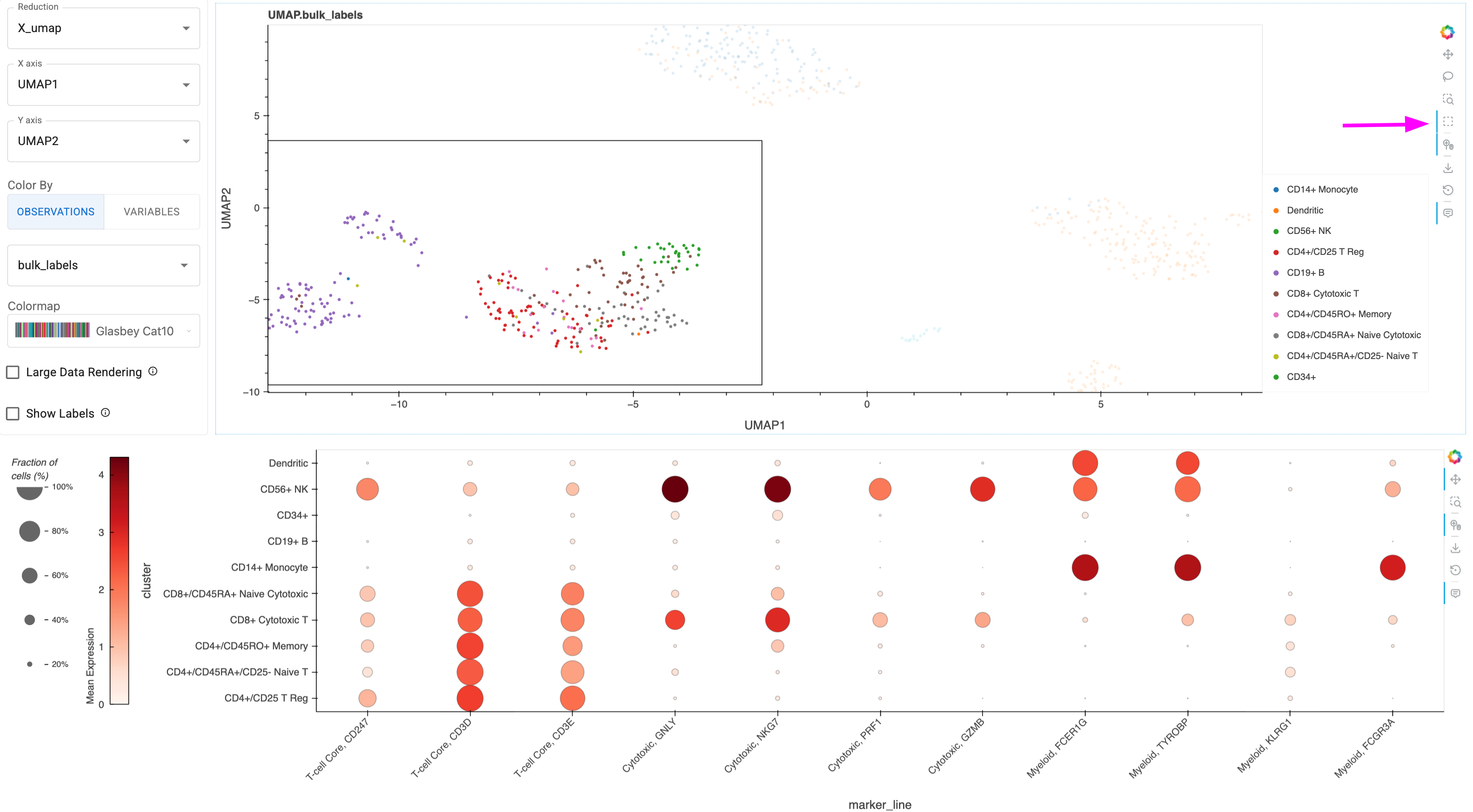
Here’s a static snapshot of what the previous cell produces in a live notebook after using the ‘Box Select’ tool from the right sidebar to select points in the ManifoldMap. You could also use the ‘Lasso-Select’ tool to free-hand trace a selection area 👉
Interactive Discovery Workflow#
Identify interesting cell clusters in the ManifoldMap using visual patterns
Select cells using Box Select or Lasso tools
Observe marker expression instantly updated in the linked DotMap
Refine hypotheses by updating the marker genes
Acknowledgments#
The functionality demonstrated in this workflow was developed in part with funding from NIH-NCI.